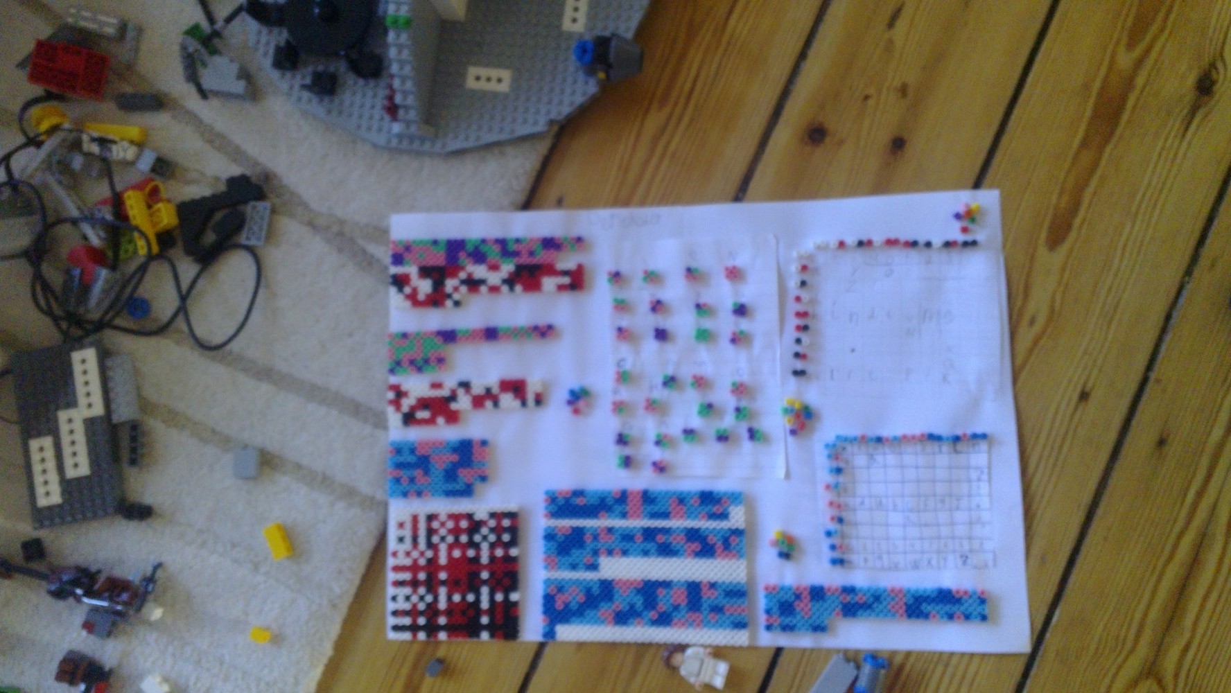
During the last few weeks, we have been improving the color alphabets that started out as a play with beads.
The first version of the alphabet was based on the idea that the most frequent letters should be represented by a single bead, the less frequent one by two beads etc. along the idea of Huffman coding.

Example of text written with the alphabet, revision 1:
As you can see in the example above, there are relatively few white beads, meaning that the alphabet is indeed quite efficient in terms of beads needed per word. On the other hand, quite a number of different colors were needed (18), making the alphabet difficult to use more widely, e.g. with color crayons or Lego.
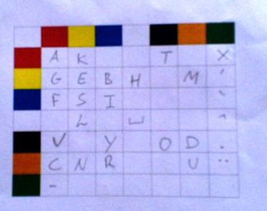
So we went on to use 2 beads per letter and the children calculated that it would require 7 different colors to cover the whole alphabet, if one wants extra space for special characters and numbers. The resulting rev. 2 of the alphabet is shown below:
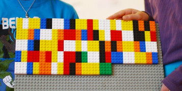
And an example of a text using Lego bricks:
But as one of our teachers is color-blind, we were soon confronted with the problem that even 7 colors can be too much.
So, what if we changed the disposition of the beads to a 2-by-2 configuration, giving us 4 beads per letter? That would give us 2x2x2x2=16 possible letters if we had 2 colors – not enough- and 3x3x3x3=81 letters with 3 different colors – enough.
We had by that time named our alphabets “Galacticode” and the first attempt at the 2-by-2 version looked like this:
Rev. 4 and 5 were modifications to rev. 3 in which we tried to facilitate the reading of the text by making each “upper row” particularly distinct, i.e. ensuring that the most frequent letters would have two identical beads in the upper row. With a little training, the eye can easily follow the lines and avoid getting lost. Revs. 3-5 are shown below:
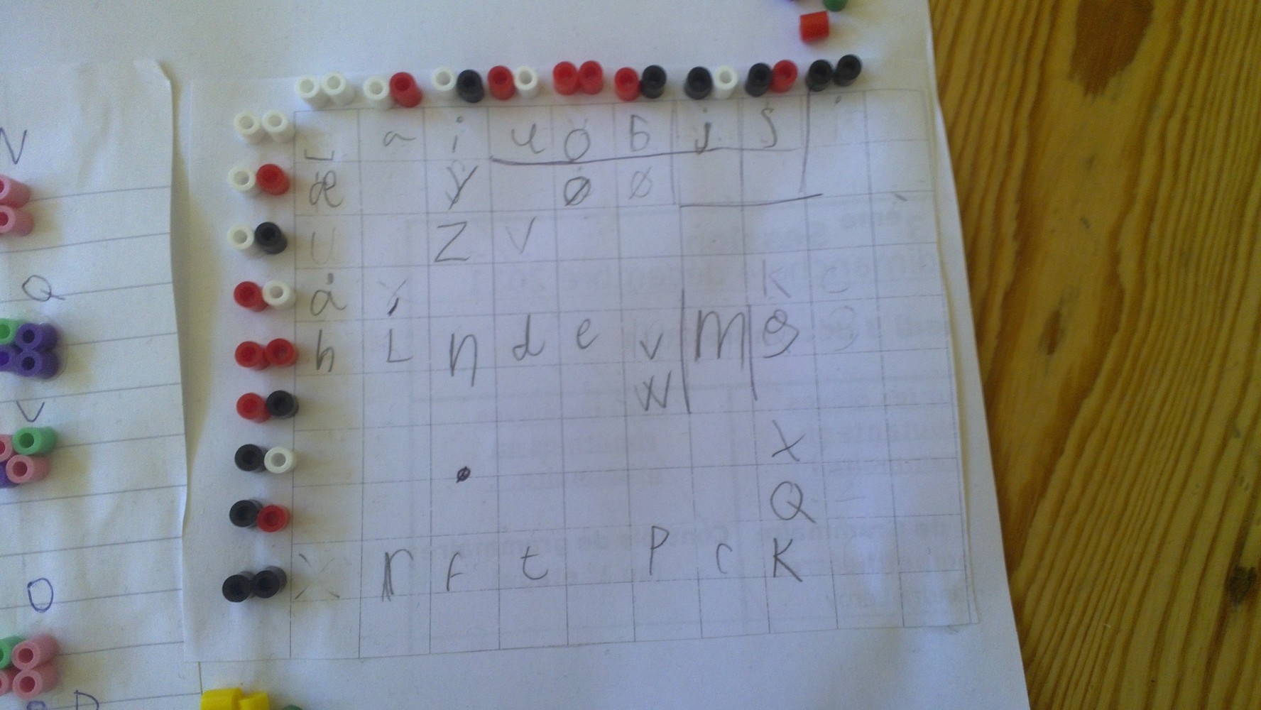
The only rule about the choice of colors is that there should be a light color, a dark color and one in between. Also, it might be a good idea to keep the same color scheme throughout a text.
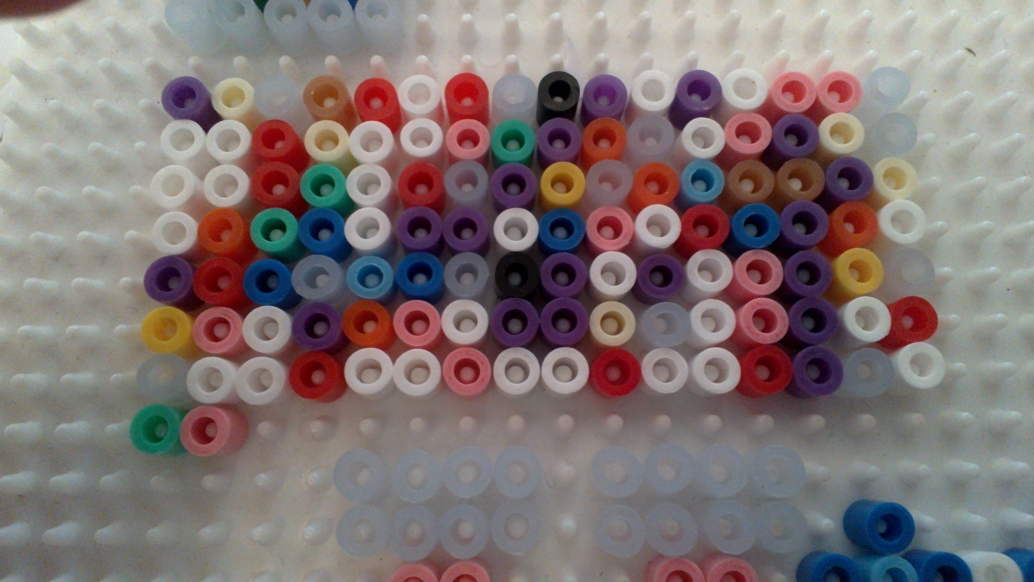
Close-up of Galacticode rev. 5, in which we have tried to make letters that sound alike look similar (e.g. d and t, p, b, v and w, g and k, n and m, i,y and j):
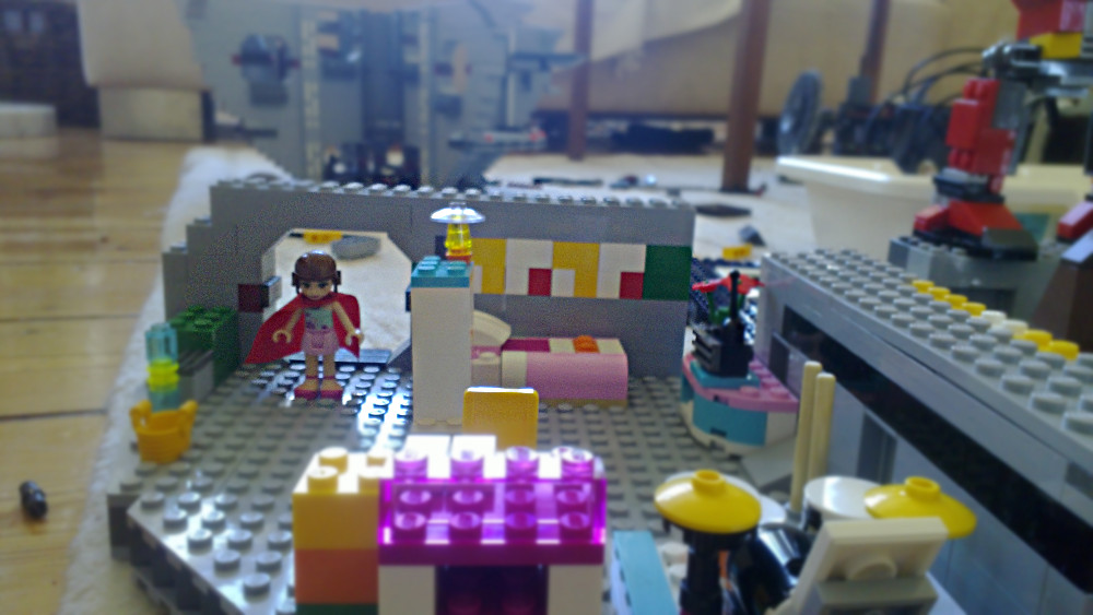
Galacticode is quite easy to use in different contexts, see a couple of Lego-related examples below:

It might also be worthwhile introducing a fourth color, i.e. having 2 grey tones between the dark and the light extremities.
But for now there is still space enough left in the Galacticode alphabet, which could be used for special characters, numbers and perhaps other things. One way to arrange for numbers would be to use those of the symbols, that when rotated can give four different symbols.

Four of those would suffice to represent e.g. a hexadecimal basis.
Alternatively we could simply use 2 rows in the alphabet matrix to achieve the same result… Or would a duodecimal or decimal basis suffice?
— there will be matter for discussion for some time in the classroom!
![]()
Have you grasped the bottom line?